Table of Contents
Network Monitoring
Introduction
I am using various tools to monitor my network at home. I am able to see the amount of bandwidth consumed by specific devices, IP addresses contacted, DNS queries made, WiFi signal quality by device, and more. Most of this data is visualised using Grafana.
The Software
ntopng
A very important part of my network monitoring is ntopng. This software can show detailed information about what each network device is doing on the network.
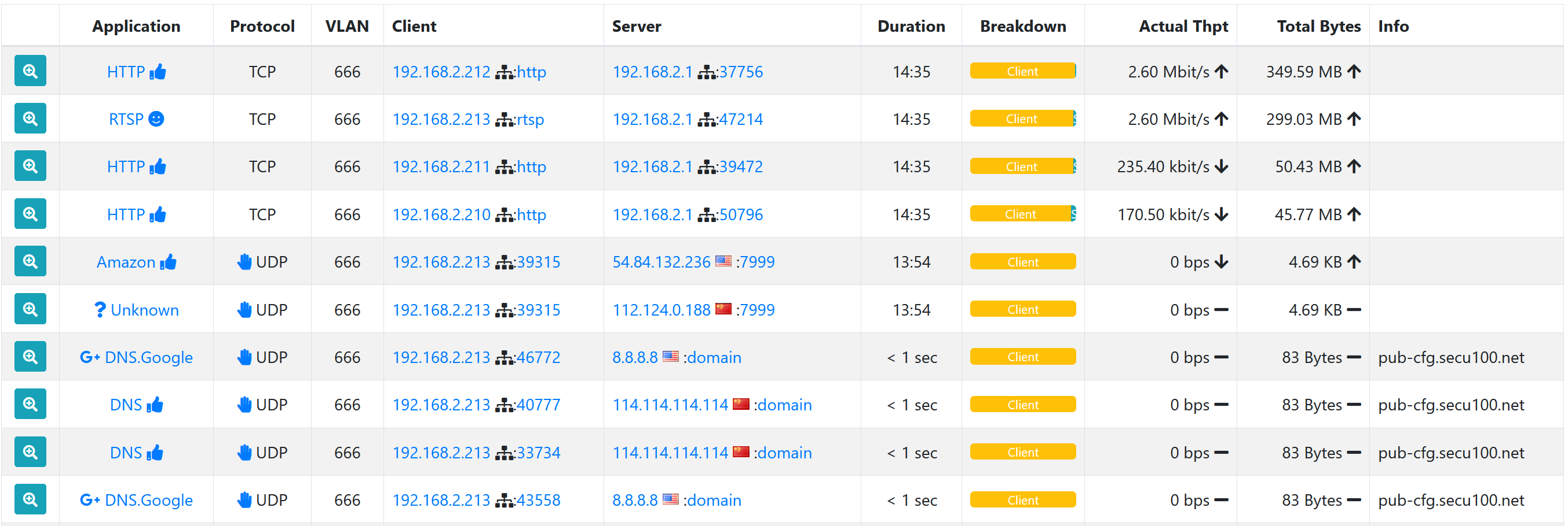
This screenshot shows active connections on my CCTV VLAN within ntopng:
This view makes it clear that regular communication is happening between the recording server at 192.168.2.1 and multiple IP cameras. In addition, we can see UDP traffic on port 7999 from one of the cameras, and DNS queries for an unusual domain from another camera.
This VLAN doesn't have internet access so none of this traffic (except to/from my server) reaches anywhere.
Ntopng has many other views and tools for monitoring the network. In addition, it also exposes some information about devices on a per-MAC basis via an API. I am using this to provide Grafana with information such as the amount of bandwidth consumed by each device.
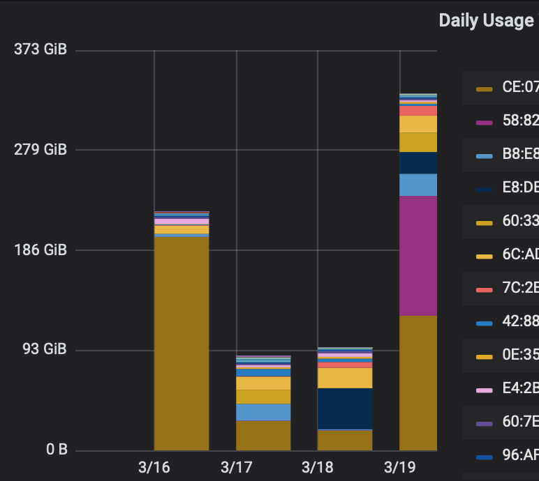
This screenshot is a bar chart within Grafana which shows the daily data transfer by MAC:
This is a good tool to determine if any devices are consuming excessive amounts of data. Internal LAN traffic is combined with external WAN traffic in this view.
The data gathered here includes every MAC address on the network so it is easy to detect when a new MAC address unexpectedly appears. ntopng also has native warnings for new MACs but can occasionally have false positives when a device is simply disconnected for weeks and then rejoins.
ntopng can also categorise traffic based on the protocol used so I can create a graph within Grafana showing bandwidth consumed by protocol, as shown below:
Suricata
Suricata is another software package I use for network monitoring. It analyses everything on the network in order to detect threats using snort IDS rules. In addition, Suricata can create a log with information about each new connection established on the network.
By forwarding all Suricata logs to Graylog (which I am also running on my home server) I can generate alerts and create dashboards from the data. I can generate warnings when credentials are sent without encryption, show a list of DNS queries made, and more.
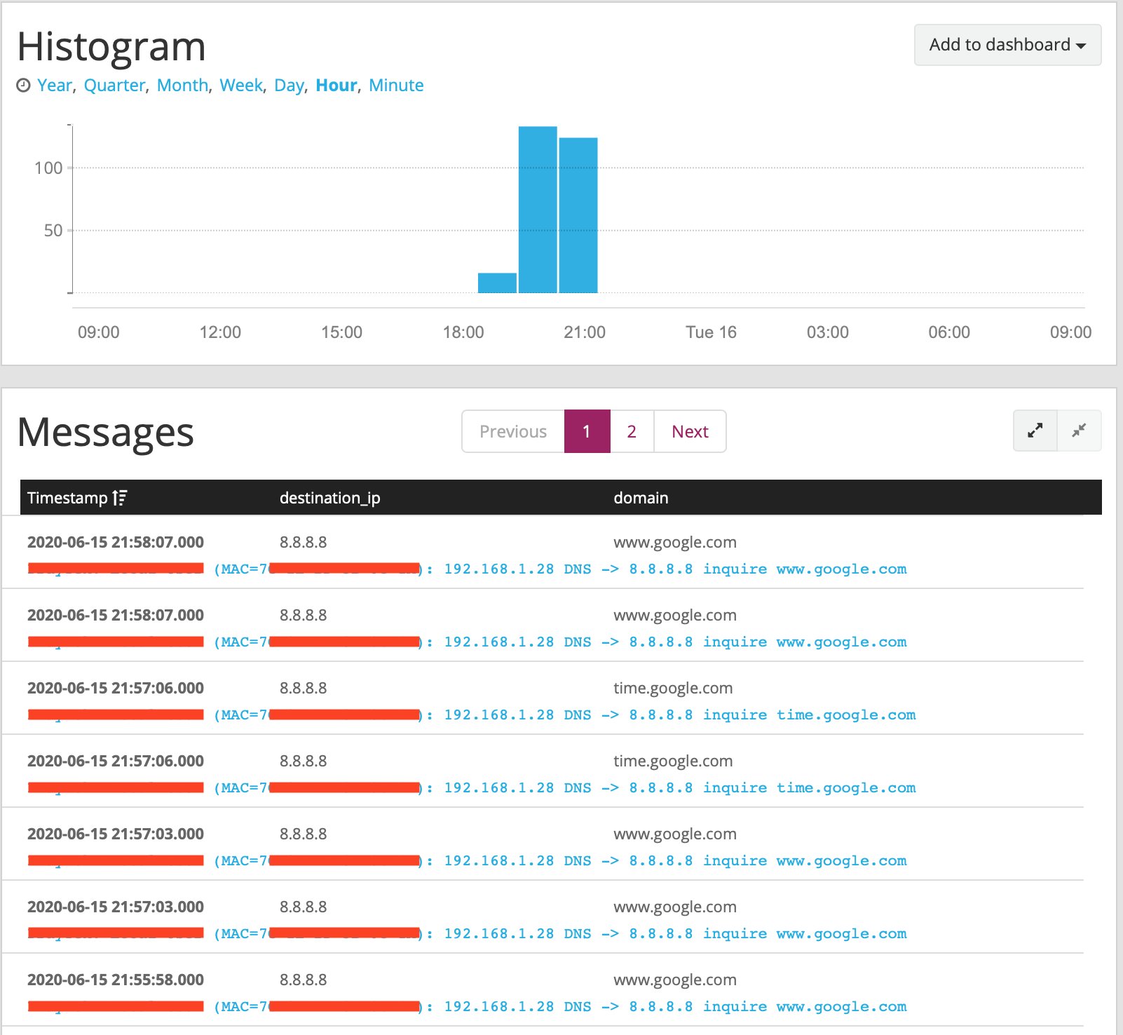
Thanks to the power of Graylog's search and visualisation options, I am able to get insight into strange behaviour on the network. For example, below is a screenshot of DNS queries to Google DNS (8.8.8.8):
We don't use Google DNS at all, so seeing this was suspicious. Google Chromecasts will ignore your DNS preferences and use Google DNS anyway, so this screenshot is showing our Chromecast traffic.
Custom Code
I have also written various scripts to pull metrics from my WiFi access points, the router, network switch, ntopng, and suricata.
The WiFi access points expose the negotiated data rate for each client, so I can graph that in Grafana:
This is the first place I look when a WiFi device is slow. Generally interference will cause the rate to drop.
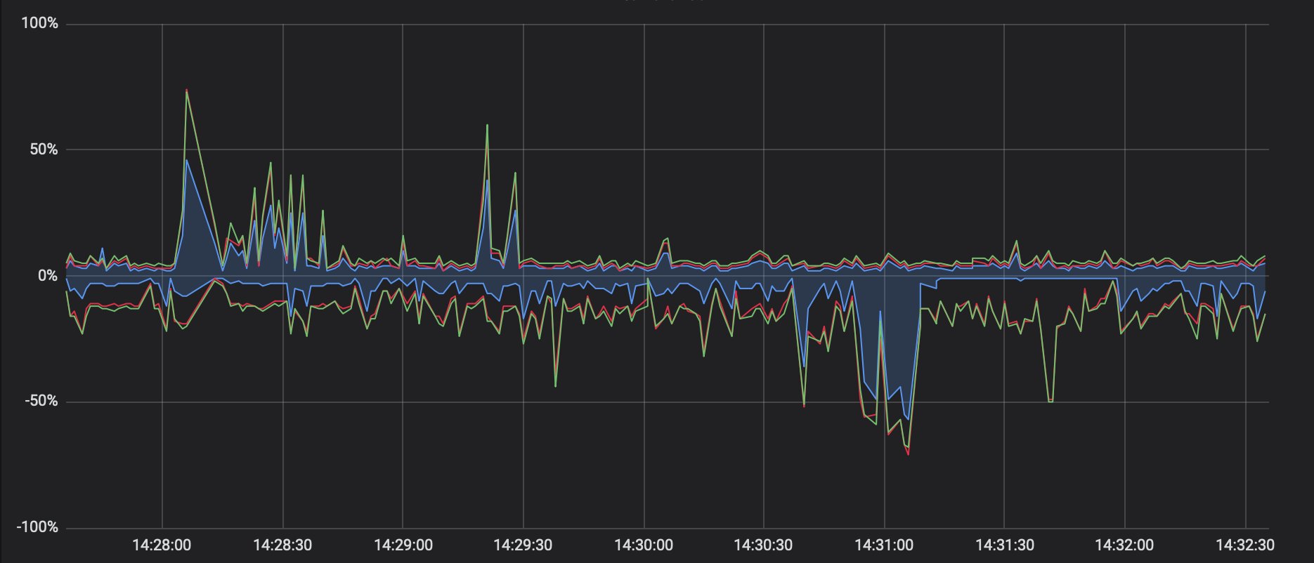
I can view a similar graph which shows the interference and utilisation of whatever channel the access points are using:
The negative axis of this graph is 5GHz, and the positive axis is 2.4GHz. The data is in percent where 100% means that channel is fully utilised and can't handle any more traffic. The solid blue area on the graph is our WiFi traffic, whereas the red/green lines show other sources (other networks, interference, corrupted packets, etc). If the other sources increase then that shows we have an interference problem which may explain slow WiFi.
When I first created this script, I was requesting data from the access points every second which caused them to crash after a few hours of uptime. The access points save the last hour of data so now I request that once per hour instead. Unfortunately, this data is stored in 1-minute resolution on the AP which is much worse than the 1-second resolution I used to be able to get (as shown in the screenshot).
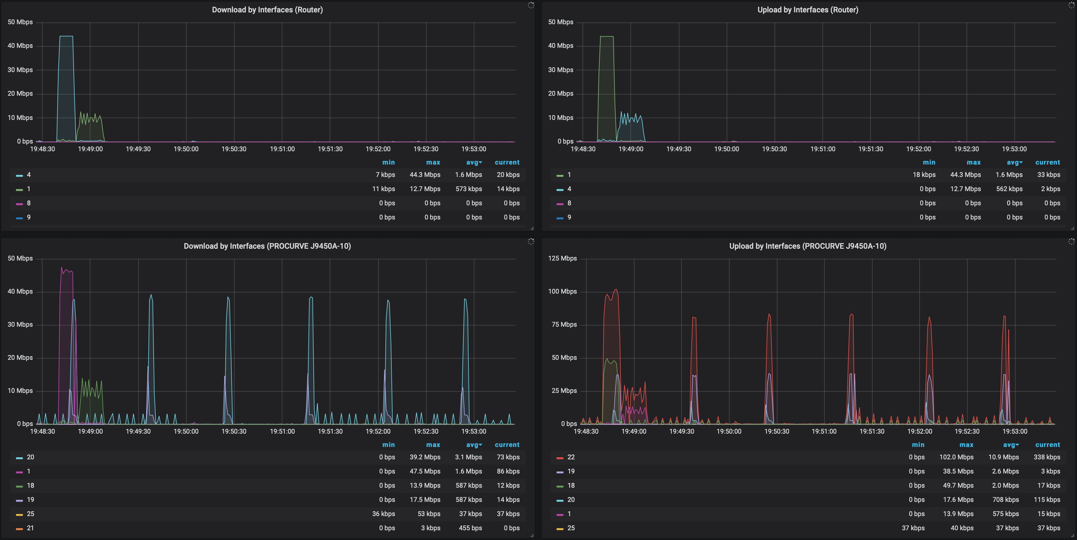
By pulling the metrics from my router and switch, I can generate graphs showing throughput per ethernet port:
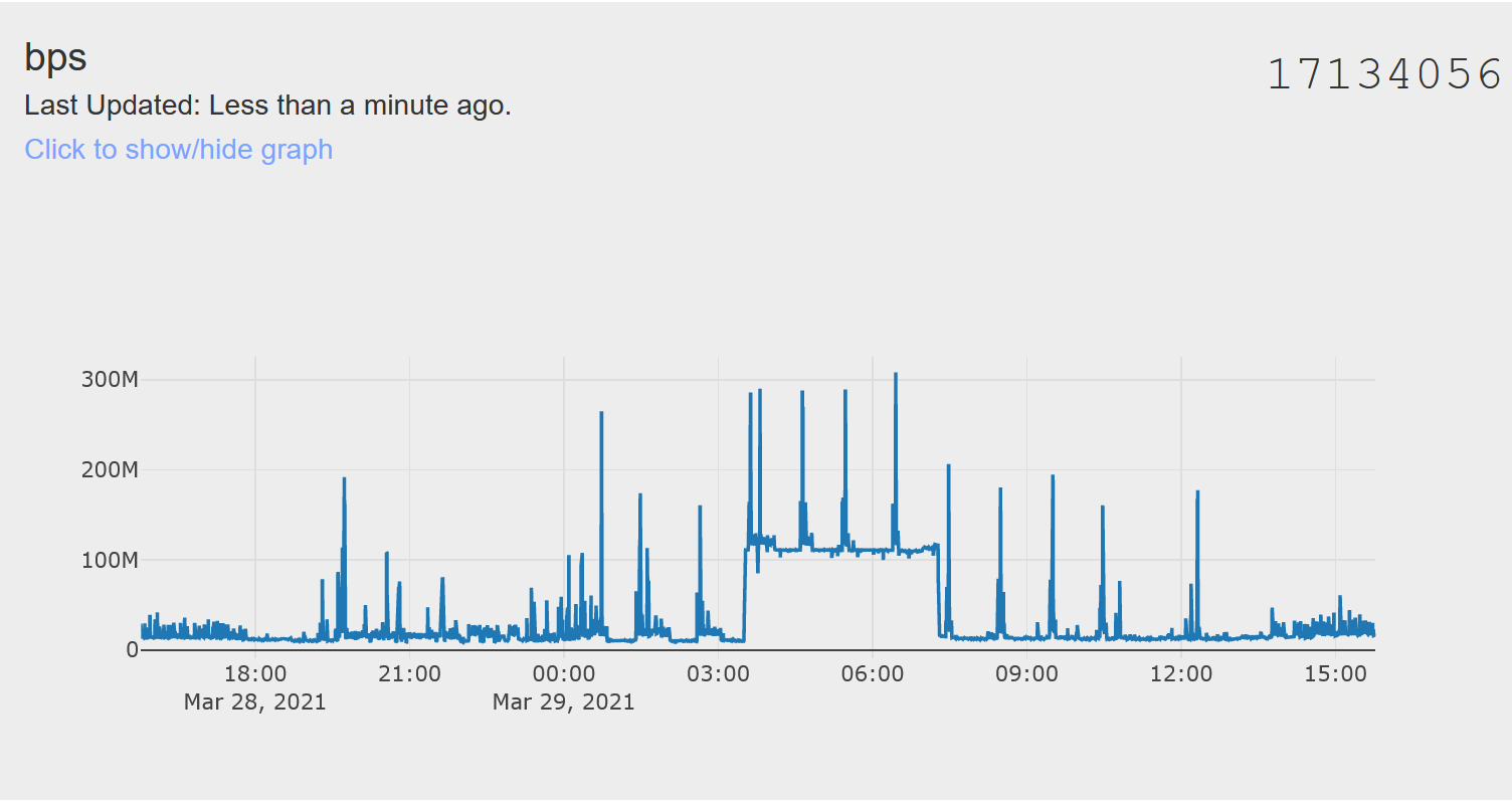
I also wrote a script which parses the result from “ifconfig” every few seconds to generate a graph of the total bits per second value for the entire network. I send this data to IoTPlotter (a service I wrote) instead of Grafana because high-resolution data loads faster than Grafana for large time scales. Here is a screenshot:
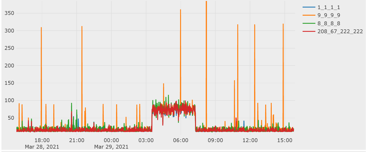
After a DNS fault on the network, I created a script to routinely monitor DNS resolvers including Cloudflare, Google, Quad9, our ISP, and more. Every minute, a query is sent to each resolver and the response time is sent to IoTPlotter. This graph shows Cloudflare (1.1.1.1), Quad9 (9.9.9.9), Google (8.8.8.8), and OpenDNS (208.67.222.222):
There is a very obvious DNS response slowdown during the night, this is because QoS is disabled on the network and a large download was occuring over night.
It is possible to zoom into IoTPlotter graphs to get a better view of the exact values. This graph is on a scale of 0 to 350ms thanks to Quad9's slow responses pushing the scale up. When our network isn't overloaded, most mainstream resolvers will respond in under 30ms here. This graph makes it clear whenever a resolver is responding slowly or not responding at all.
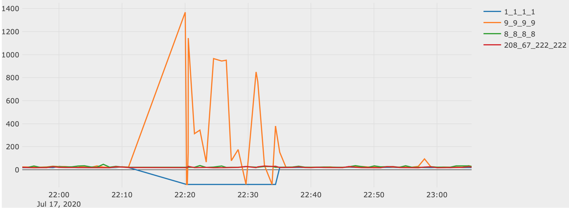
During a Cloudflare outage in July 2020, the DNS monitoring caught a lack of responses from Cloudflare (negative numbers on the graph) and excessively slow responses from Quad9 including some timeouts:
This graph shows that Google DNS and OpenDNS were unaffected.
This graph also shows about 10 minutes of missing data. This was caused by the Cloudflare outage so I should also save this data locally (in Grafana) to prevent lost data during future outages.
Update on 28th May 2021: I wrote a script to push the stats from my Pi-Hole DNS server to Grafana. I am now able to visualise DNS reponse times from actual DNS queries locally. See the below image for an example:
Pi-Hole will automatically switch to another upstream DNS resolver if one starts responding slowly. This means that large gaps appear in the monitoring for each resolver whenever they go out of use.
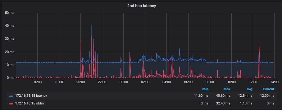
By monitoring the latency to reliable sources (Google DNS and Cloudflare DNS), I have discovered that occasionally our ISP will do something which affects our latency by as much as 5ms. I started performing automated traceroutes to see if I could determine the cause of this but I have discovered it is probably interleaving on the VDSL2 connection.
I have started visualising the 2nd hop latency (first hop after our router) with Grafana, as shown below:
Our router also logs various DSL metrics via syslog to my Graylog server which I can visualise within Graylog:
I only recently started graphing the attenuation and signal to noise ratio (SNR) which is why the graph is only half-filled.
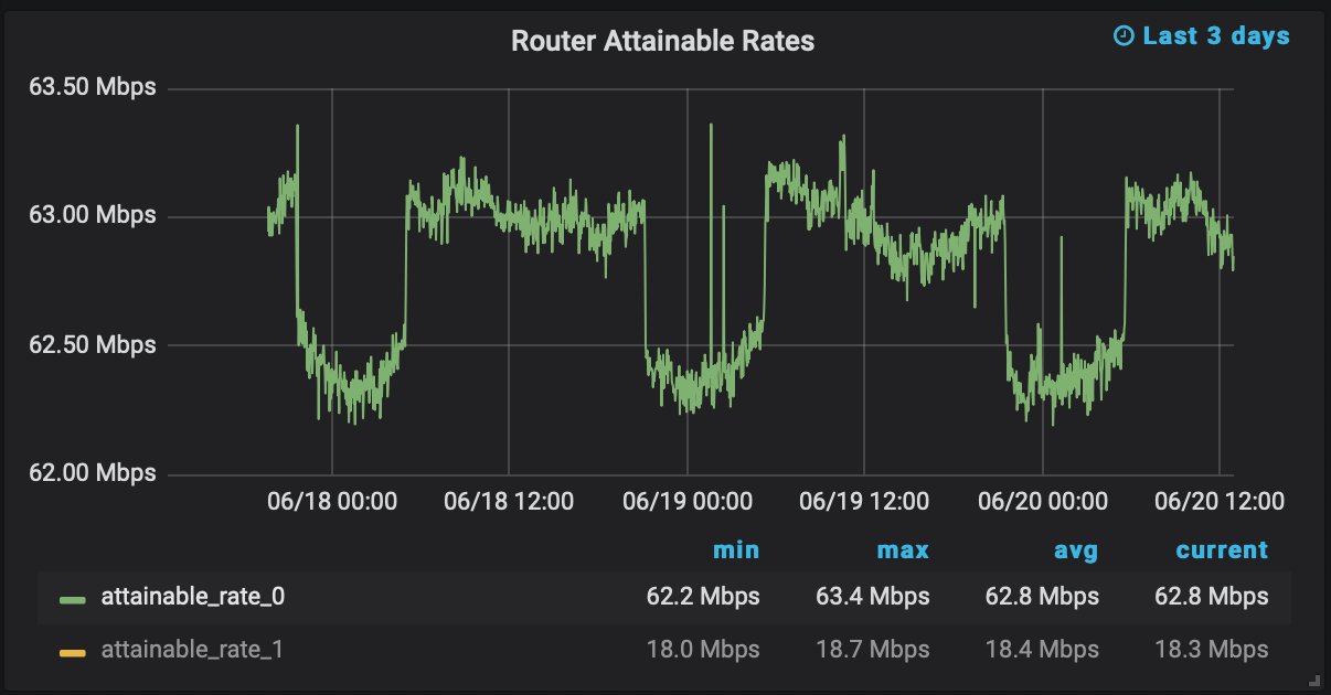
In June 2021, I started making improvements to the WAN-side cabling to improve the VDSL2 connection and hopefully reduce the amount of interleaving; this should lower our latency. In order to monitor any improvements, I started pulling the full DSL stats from the router rather than just the logs. I am now able to monitor the error count, maximum attainable rate, and more. This graph shows the maximum attainable rate which is reduced by about 500Kbps each night:
Logging
Most of the data I collect is simply a numerical representation of what is happening on the network (bits per second, DNS query count, etc). This is useful as a tool to notice when something strange is happening but can't really be used to determine what happened.
The logs generated by Suricata in addition to logs by my access points and router are all saved into Graylog for a year. I can drill down to a specific time period to see which servers were contacted and which device opened the connection, I can also see detailed protocol information including packet inspection logs.
So far, I have been able to trace the cause of every suspicious network event. Naturally, malicious traffic designed to evade intrusion detection systems may be harder to trace but I consider this setup to be very comprehensive, especially since this is only a home network.

