Table of Contents
Internet Exchange Point (IXP) Monitoring
Introduction
Internet exchange points exist all around the world and allow multiple internet service providers (ISPs) or content delivery networks (CDNs) to connect to other networks. They typically have large amounts of bandwidth and lots of companies connected to them.
I noticed some IXPs have public status pages which include the amount of traffic currently being transferred through them. For example, the London Internet Exchange (LINX) has a stats page which shows the throughput in each of their locations.
I created some scripts which would collect this information from as many public IXPs as I could find and save it into a database. I can now visualise this data using a simple Grafana dashboard.
The Dashboard
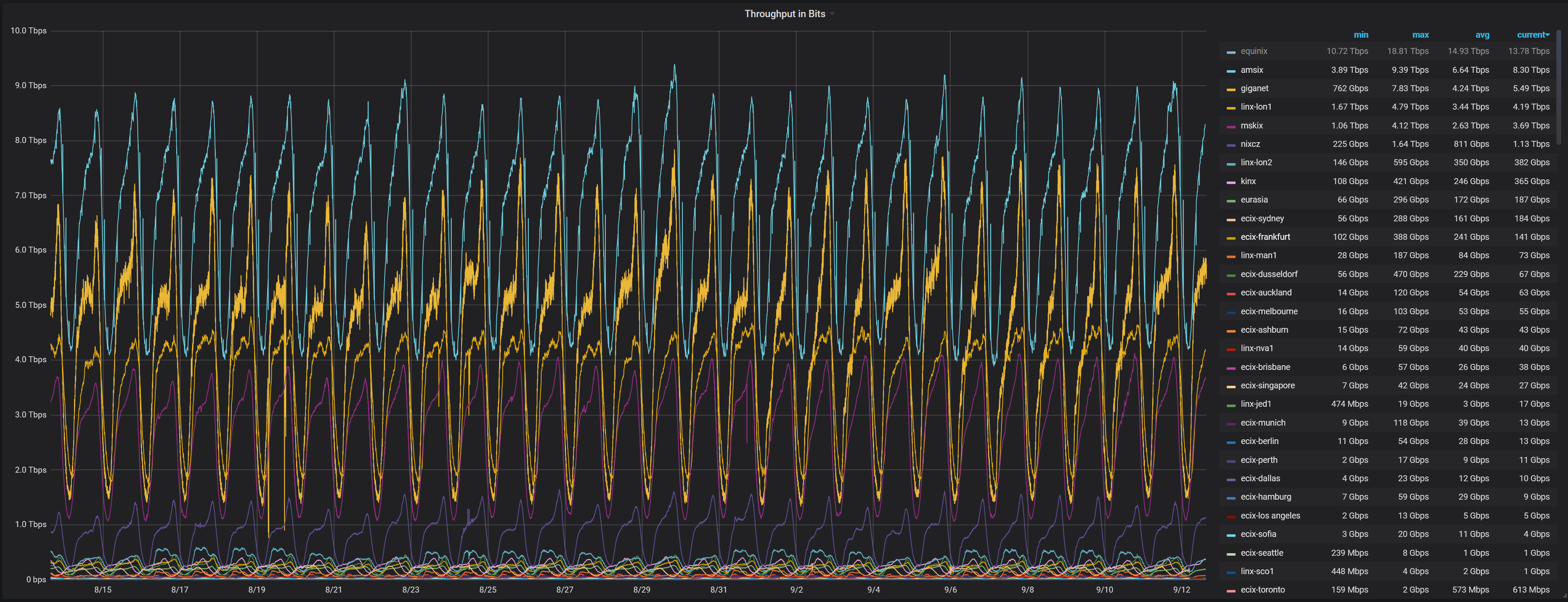
I can visualise all of the IXPs at once on a single plot with a custom time range. For example, here is all IXPs plotted for the last 30 days:
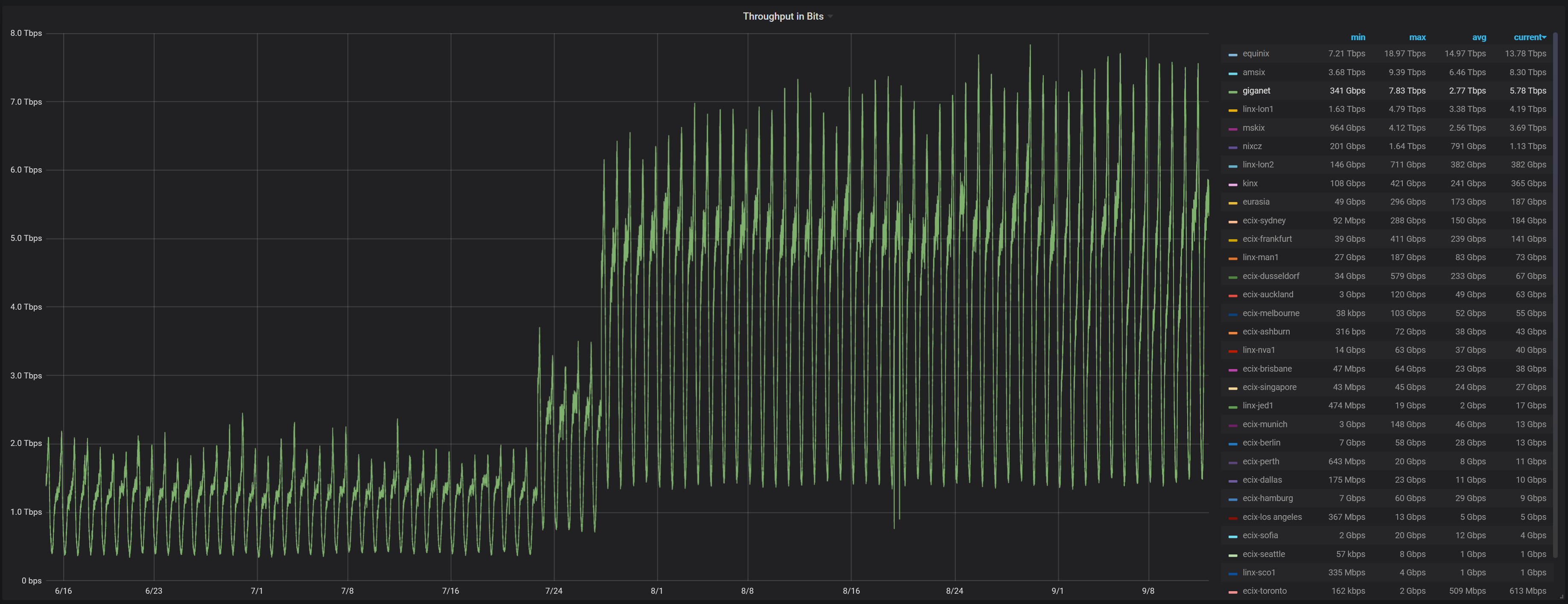
This isn't particularly clear due to the amount of IXPs being displayed at once. I can focus on a single IXP to make things clearer. For example, here is a graph of giganet IXP throughput for the last 90 days:
Interestingly, giganet had a large increase in July. However, when I look on the giganet statistics page, I can see one graph shows the old traffic levels but the real time graph shows the elevated traffic levels.
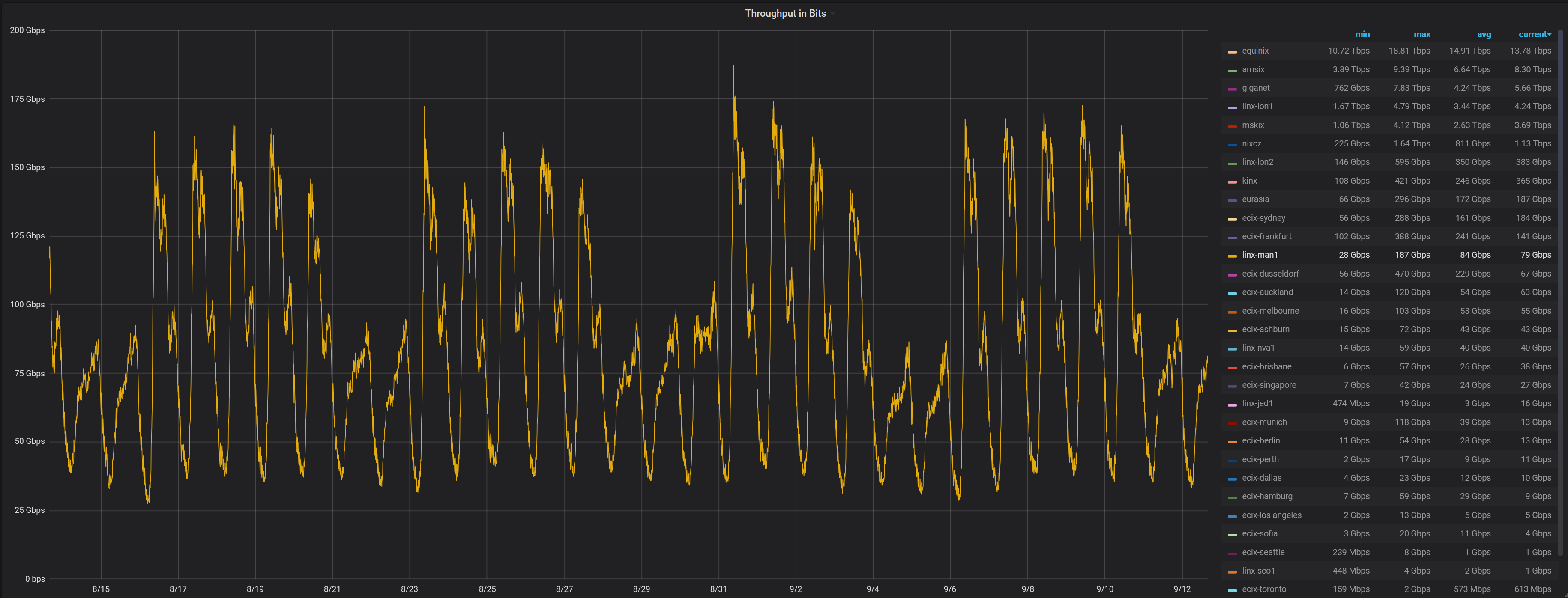
Some of the graphs clearly show which times people use more bandwidth. It is even clear which days are weekends on this LINX Manchester graph:


